Brand Portal & Partner Guidelines
Version 1.0 · 2026
Everything you need to represent pyxartis cleanly — colors, typography, logo files, partner badges, co-branding lockups, and social media starter templates. All assets below are downloadable and current as of the version above.
01 — Color
The brand anchors on a single color — tapestry — with a full ramp from the lightest tint to the darkest shade. Four accent colors handle hover states, alerts, action, and quiet backgrounds.
Tapestry ramp
50
#faf3f9
100
#f3e0ef
200
#e8c1de
300
#d89dcb
400
#c478b3
500
#a85da3
Brand anchor
600
#8c4787
700
#6f376c
800
#4d2a4c
900
#311b30
950
#1c0f1c
Accents
orchid
#d89dcb
Hover, dividers, secondary tags
wepeep
#f0c1e2
Quiet card backgrounds
marigold
#f8d77c
Status badges, alerts
carrot
#f28b1c
CTAs, action emphasis
Backdrop & surface
| Token | Hex | Purpose |
|---|---|---|
| --color-background | #050211 | Marketing site backdrop |
| --color-foreground | #f5f0fa | Marketing site text |
| --color-liquid-from | #050211 | Liquid gradient start |
| --color-liquid-mid | #0a0420 | Liquid gradient mid |
| --color-liquid-to | #160a30 | Liquid gradient end |
CSS variables
Drop-in :root tokens · 1.5 KB
02 — Typography
Minimo is the working typeface — Light (300) is the workhorse; Medium (500) and Bold (700) handle UI emphasis and weight. Cormorant Garamond is the editorial serif companion, reserved for cinematic hero headlines on the marketing site (e.g. the homepage). The fluid scale uses CSS clamp() so type smoothly resizes between viewports — no media-query stepping.
Hero (serif)
font-serif
clamp(1.875rem, 0.875rem + 4.7vw, 5.75rem)
line-height 1.04
Cormorant Garamond. Used only for cinematic hero headlines on dark surfaces (homepage hero). Body and UI stay in Minimo Light.
Display
--text-fluid-display
clamp(2.25rem, 4vw + 1rem, 4.5rem)
line-height 1.05
H1
--text-fluid-h1
clamp(2rem, 3vw + 0.875rem, 3.75rem)
line-height 1.1
H2
--text-fluid-h2
clamp(1.5rem, 1.75vw + 0.75rem, 2.75rem)
line-height 1.15
H3
--text-fluid-h3
clamp(1.125rem, 0.75vw + 0.75rem, 1.5rem)
line-height 1.3
Lead
--text-fluid-lead
clamp(1rem, 0.6vw + 0.875rem, 1.375rem)
line-height 1.55
Available weights in the licensed Minimo file: 300 Light, 400 Regular, 500 Medium, 700 Bold — plus oblique companions for each. Weights below 300 (Thin / ExtraLight) are not currently licensed; use 300 as the lightest available step.
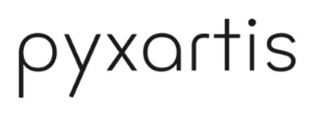
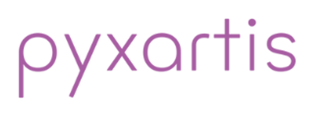
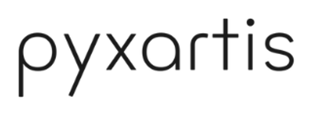
03 — Logo
Lowercase. Always. The wordmark is set in a customized Minimo Thin and shouldn't be re-typed in any other typeface. Below: the four approved color treatments and what to avoid.
On indigo · primary
On tapestry · primary alt
On light backgrounds
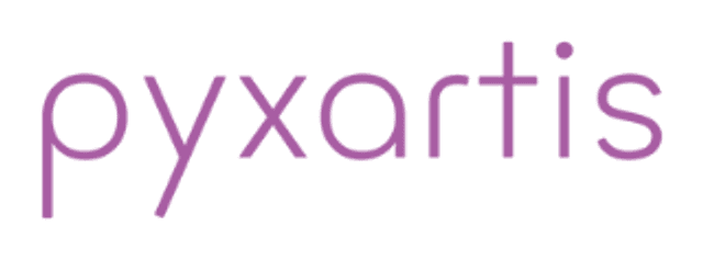
On white · tapestry
✗ Don't capitalize
The wordmark is always lowercase. No exceptions.
✗ Don't recolor
Use only the approved color treatments shown above.
Wordmark — original SVG
Color-neutral · scales infinitely
White — for dark backgrounds
640px wide · transparent · ~10 KB
Tapestry — for light backgrounds
640px wide · transparent · ~12 KB
Ink — for light backgrounds, print
640px wide · transparent · ~12 KB
Indigo — premium contexts
640px wide · transparent · ~12 KB
04 — Components
Buttons, status badges, and the spacing rhythm we use across the order portal and partner dashboards. These are the actual values shipped in production — copy them into your integrations and you'll match the live system.
Buttons · light surfaces
Primary, secondary, and accent variants — used on marketing pages, forms, and the brand portal itself.
Buttons · dark surfaces
Glass variants used on the marketing site's dark backdrop and across portal navigation. The blur effect needs a backdrop with color and texture to read correctly.
Order status badges
Eight states cover the full order workflow — from pending_payment through delivered. Shown here on the dark portal surface where customers and partners actually see them.
Spacing scale
Tailwind v4 base — every increment is 4px. We use space-1 (4px) through space-24 (96px) day to day, with section padding sitting at space-20 or space-24.
1
4px
Micro
2
8px
XS
3
12px
SM
4
16px
Base
6
24px
MD
8
32px
LG
12
48px
XL
16
64px
2XL
20
80px
Section
24
96px
Section LG
05 — Co-branding
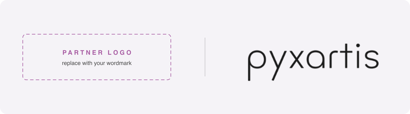
When your brand and pyxartis appear together, use the approved lockup pattern: partner logo on the left, a hairline vertical rule, pyxartis wordmark on the right. Equal visual weight, generous clear space.
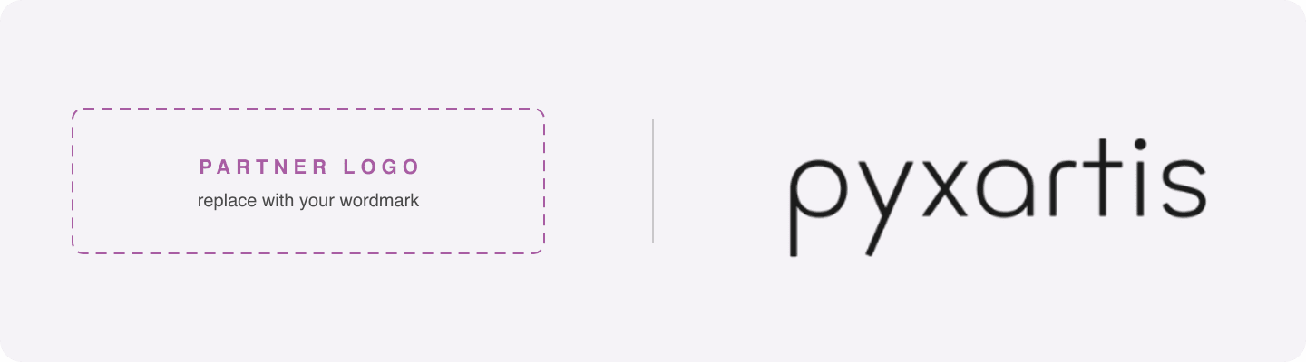
✓ Do · Do
Equal visual weight on both sides. Vertical hairline rule (1px) as the separator. Maintain clear space — at least the cap-height of pyxartis on every side.
✗ Don't · Don't
Don't use “powered by,” “provided by,” or any phrasing that frames pyxartis as a hidden vendor. Don't size the pyxartis wordmark smaller than the partner mark. Don't place the lockup on a busy or low-contrast background.
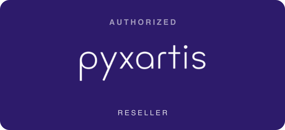
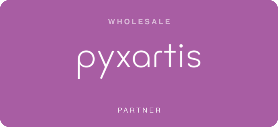
06 — Partner badges
Each partner tier gets one approved badge. Use the badge that matches your agreement; don't use one you haven't been given. Don't recreate them in your own design tool.
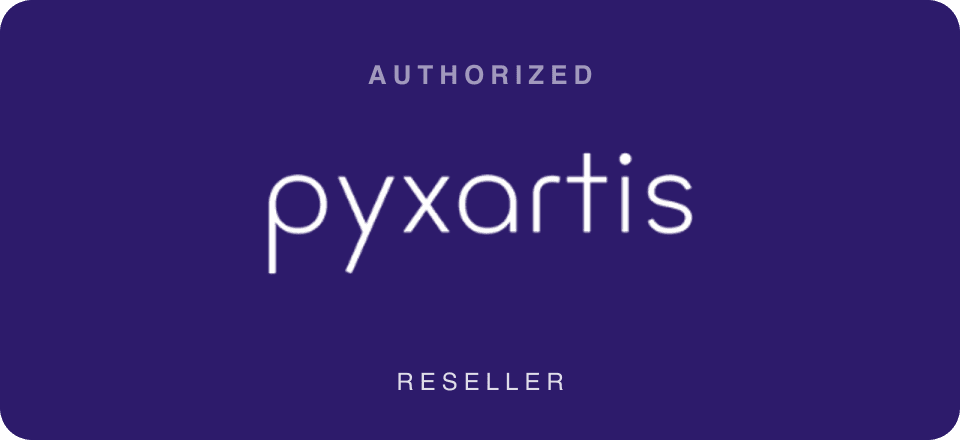
Camera shops, labs, and studios that sell pyxartis services directly to their clients.
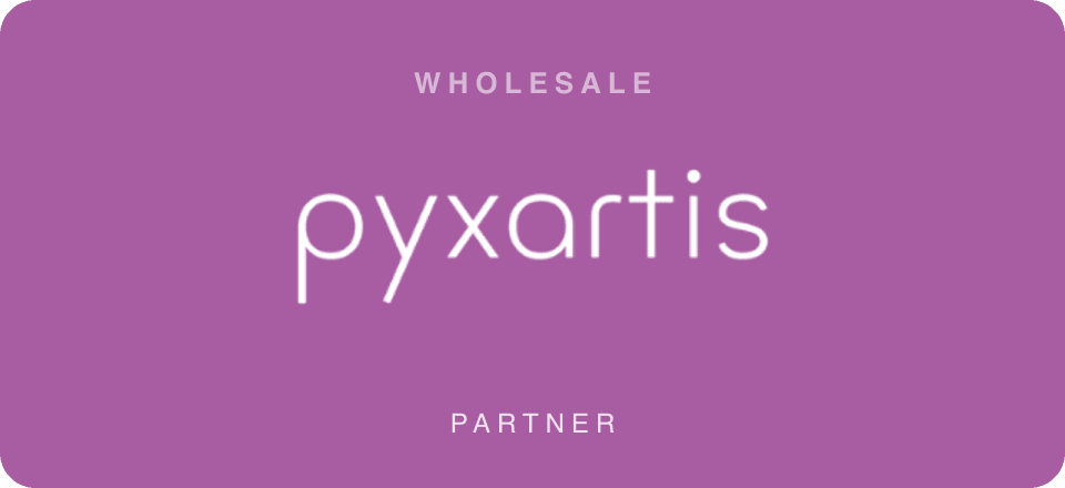
Wholesale partners purchasing in bulk for distribution. Brand usage is partner-facing, not consumer-facing.
08 — Voice
pyxartis speaks like a master craftsperson who also happens to know how to run a business. When you write about us, hold to these four principles.
Resolution, bit depth, color gamut — we use the right words. But specs always serve the artwork. We never let the technical language bury the point.
We're the best at what we do, and we say so plainly. We never punch down. Confidence doesn't need volume — it needs clarity.
Artists and collectors are busy. We get to the point, tell them what they need to know, and trust them. No filler, no exclamation points.
We genuinely love this work. That love shows up in careful language — not in superlatives. Words like “extraordinary” are earned, not sprinkled.
Words in action
✓ Say this
“We capture your work at 600 PPI — enough to print at three times original scale without losing a single detail.”
✗ Not this
“Our world-class, cutting-edge technology delivers transformative, museum-quality solutions that leverage the best-in-class imaging ecosystem!”
✓ Say this
“Your scans are ready. Download them — they're yours, in the original format, for as long as you need them.”
✗ Not this
“We're so thrilled to let you know your amazing order is complete! Please don't hesitate to reach out if you have any questions at all!”
09 — Contact
Before using the pyxartis brand in any new context — a print run, a co-branded campaign, a product collaboration — write to us first and we'll respond within one business day.
Send proposed usage, mockups, co-branded materials, or print files. We reply within one business day.
Brand kit v1.0 · Updated May 2026 · For authorized partners only.

07 — Social media
Starter templates.
Branded backgrounds at platform-correct dimensions. Use them as a base in your design tool — drop your imagery, headlines, and CTAs on top. Never crop or squish the wordmark to fit.
Instagram · Facebook square
1080 × 1080 px
Instagram Story · TikTok
1080 × 1920 px · vertical
LinkedIn banner
1584 × 396 px